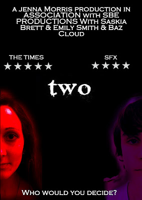
This is the final design for my short film poster. Through the construction and research phase this design has been edited and then altered in order to try and make it the most effective method of advertising as well as an aesthetically pleasing design that the audience will react to. The design used on this poster was not one of my original ideas but was developed in order to symbolize the strong theme that runs throughout the films narrative. It was constructed using Photoshop CS4, in order to produce an accurate and professional piece. I am pleased with the final outcome of this design as in my personal opinion it represents important emotions from the piece such as danger, fear and love accurately.
Sunday, 3 April 2011
Subscribe to:
Post Comments (Atom)
Blog Archive
-
▼
2011
(30)
-
▼
April
(11)
- Evaluation- How did you use media technologies in ...
- Evaluation - What have you learned from your audie...
- Evaluation - How effective is the combination of y...
- Evaluation - In what ways does your media product ...
- Final Product- Short Film
- Final Ancillary Task - Review
- Final Ancillary Task - Poster
- Development on the Poster
- Filming/Editing Issues
- Poster Idea Clarification
- Distribution of my Short Film
-
▼
April
(11)

No comments:
Post a Comment